
Introduction
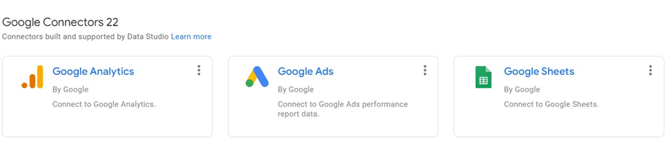
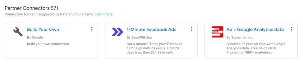
Google Cloud Data Studio is a tool for transforming data into useful reports and data dashboards. As of now, Google Data Studio has 22 inbuilt Google Connectors and 571 different Partner connectors which help in connecting data from BigQuery, Google Ads, Google Sheets, Cloud Spanner, Facebook Ads Data, Adobe Analytics, and many more.

Once the data is imported, reports and dashboards can be created by a simple drag and drop and using various filter options. Google Cloud Data Studio is out of the Google Cloud Platform, which is why it is completely free.
Accessing Data Studio
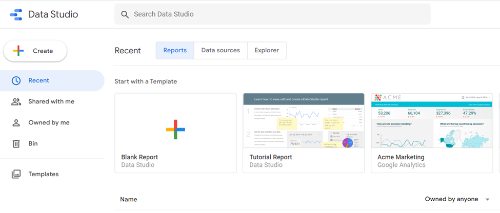
Since Data Studio is out of GCP, simply search "Google Cloud Data Studio" and open the first link or directly open the link “datastudio.google.com” on the browser.
This article focuses on analyzing the employee data with 5,000 records downloaded from here.
A few important columns in the sample data are:
- Name Prefix
- Age
- Gender
- Salary
- Place Name
- County
- State
- Region
- Year of Joining
- DOB
- Date of Joining
Analyzing Data
First, the data needs to be uploaded to Google Cloud Data Studio by clicking on the “Blank Report” option. Next, select the “File Upload” option, as the data exists on the local machine which requires an Upload to Data Studio.

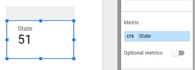
As soon as the file is uploaded, the Data Studio gives a default view on a random column and “Record Count” as a default metric. The sheet can be renamed and the default view can be removed. Data Studio gives us various chart options such as “Scoreboard,” “Table,” “Time Series,” “Bar,” and “Pie." To begin, the simplest chart can be selected, which is the “Scoreboard,” and by default, the “Scoreboard” returns the total number of records in a sheet.

Any column can be selected from the sheet in the right panel “DATA,” and the style can be modified using the “STYLE” option on the right panel.

Changing the metric “State” will return the total number of distinct States in the Employee Data.
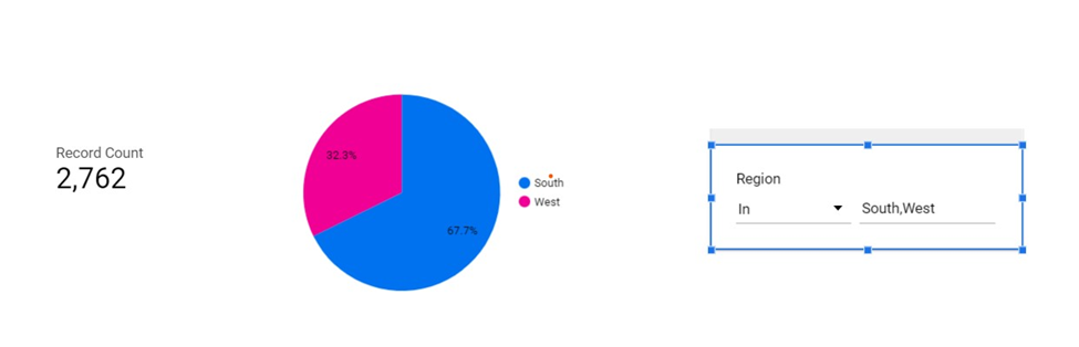
Just like with Scoreboard, "Pie Chart" can be used for showcasing percentages like profits from different countries, the number of employees from different countries, etc. In the Employee Data Analysis, we can use a pie chart to display the percent of employees belonging to different regions in the USA. In the Dimension section select “Region.”

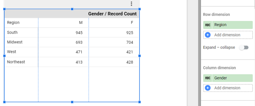
Pivot Table
Pivot tables help in organizing the data by multiple categories, such as breaking down regional "Gender/Record Count." Data Studio provides Row Dimension and Column Dimension options for data distribution. In the example below, the row dimension is "Region" and the column dimension is "Gender."
The grand total can be done both via rows and columns in Data Studio. The "Totals" section provides the option of displaying the grand total.
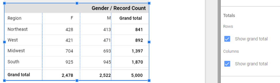
Data in the pivot table can be sorted in ascending/descending order.
![Pivot table data - ascending/descending]()
![Pivot table data - ascending/descending]() Adding Controls
Adding Controls

Advance Filter
The Controls allow for filtering of the data or changing the display of the data in the report. The most important control is the “Advance Filter.” This filter helps in filtering the data based on fields and conditions. In the example of the Pie Chart where the chart is created based on the “Region” attribute, this data can be further filtered based on only the “South and West” region.
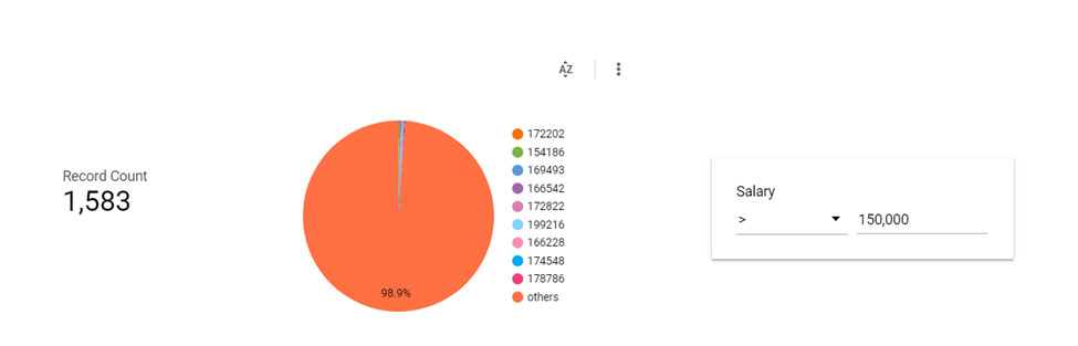
Another example below is filtering based on numeric columns, finding employees with Salaries greater than 150K.
List
Data Studio provides two List Options: “Fixed Size List” and “Drop Down List.” Drop Down displays the control in a drop-down combo box and Fixed Size control displays the data as a fixed-size box.
Drop Down

Fixed Size

Styling
Data Studio exclusively provides the option of adding styles to the charts/tables, users can add Headers/Title, or style them as well. Data Studio also provides conditional styling options such as showing the row in red if the number is greater than the "x" value.
Let’s add some style to the pivot table example breaking down regional gender data distribution. To add style to the components, the user needs to change the defaults from the "STYLE" section.

In the example, we will show the Record Count value in red color when the value is less than 500.
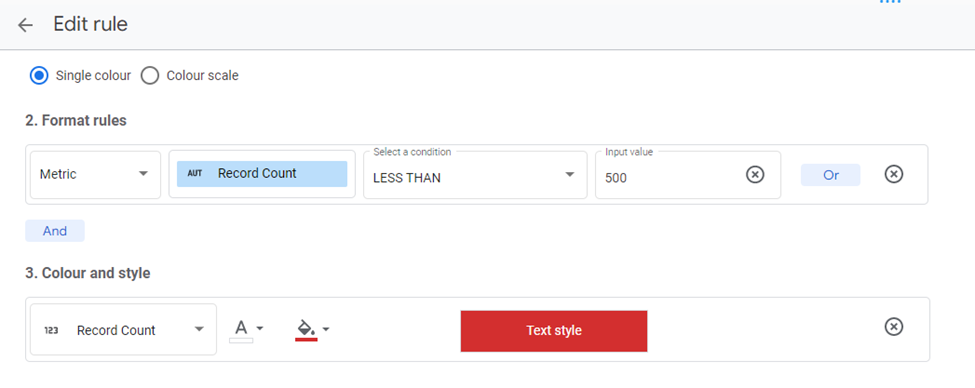
Which results in the following:

Summary
Google Data Studio is a complete tool for proper data analysis by simple drag and drop, where no code data can be analyzed. It supports 571 partner connections and 22 Google connectors from which data can be imported easily and analyzed. The Dashboard updates in Data Studio are real-time, and above all, it’s a free tool for the most part. In order to integrate with some other external apps like Shopify or Coupler.io, use needs licensing. Reports prepared in Data Studio can be imported as PDF, and also it provides the option of adding themes and layouts.
文章来源于互联网:Data Analysis Using Google Cloud Data Studio
发布者:小站,转转请注明出处:http://blog.gzcity.top/4200.html
 微信扫一扫
微信扫一扫  支付宝扫一扫
评论列表(40条)
квартира от застройщика Санкт-Петербург в новостройках Санкт-Петербурга. Цены и фотографии квартир от застройщика в готовых и строящихся ЖК. Подбор жилья, ипотечные программы, сопровождение сделок и выгодные предложения.
квартиры в новостройках Санкт-Петербурге купить квартиру в Санкт-Петербурге от застройщика
Драгон Мани Казино https://krpb.ru – ваше место для азартных приключений! Наслаждайтесь широким выбором игр, щедрыми бонусами и захватывающими турнирами. Безопасность и честная игра гарантированы. Присоединяйтесь к нам и испытайте удачу в самом захватывающем онлайн-казино!
купить квартиру в казани https://nedvizhimost47.ru
buy priligy in uae Even then, they don t immediately go riding off into the sunset without a care in the world
Поклонникам творчества Игоря Талькова, не пропустите!
По ссылке вы найдете легендарную композицию “Я Вернусь” Игоря Талькова Игорь Тальков Я Вернусь.
Переживите момент ностальгии прямо сейчас!
PKm Ome
Your article helped me a lot, is there any more related content? Thanks!
римские шторы на карнизе [url=https://prokarniz24.ru/]римские шторы на карнизе[/url] .
Very good write-up. I definitely love this website.
Keep writing!
Having read this I believed it was rather informative.
I appreciate you taking the time and energy to put this
article together. I once again find myself spending
way too much time both reading and leaving comments. But so what, it was still worthwhile!
Heya i am for the primary time here. I came across this
board and I in finding It truly useful & it helped me out a lot.
I am hoping to offer one thing again and help others such
as you aided me.
Hello There. I discovered your blog using msn. This
is an extremely well written article. I will be sure
to bookmark it and come back to learn more of your useful information. Thanks for the post.
I will certainly comeback.
Greetings! Very helpful advice within this
article! It is the little changes that produce the most significant changes.
Many thanks for sharing!
I have been exploring for a bit for any high
quality articles or weblog posts on this kind of area . Exploring in Yahoo I ultimately stumbled upon this website.
Studying this info So i’m satisfied to show that I’ve an incredibly good uncanny feeling I discovered just what I needed.
I so much indisputably will make sure to do not omit this site and give it
a look regularly.
excellent submit, very informative. I wonder why the
other experts of this sector do not notice this. You should continue your writing.
I am confident, you have a great readers’ base already!
You actually make it appear really easy along with your presentation but I to
find this matter to be really something that I feel I would
by no means understand. It seems too complex and very large for me.
I’m having a look forward for your subsequent put up, I’ll try to
get the hang of it!
I like the valuable information you provide in your
articles. I will bookmark your blog and check again here frequently.
I am quite certain I’ll learn a lot of new stuff right here!
Good luck for the next!
Do you have a spam problem on this site; I also am a blogger, and I was wanting to
know your situation; we have created some nice procedures and we are looking
to swap solutions with other folks, why not shoot me an e-mail if interested.
My partner and I stumbled over here from a different website and thought I should check things
out. I like what I see so i am just following you. Look
forward to going over your web page for a second time.
If you would like to increase your knowledge simply keep
visiting this site and be updated with the most up-to-date gossip posted here.
Attractive section of content. I just stumbled upon your
weblog and in accession capital to claim that
I get in fact enjoyed account your weblog posts. Anyway I will be subscribing in your
augment or even I achievement you get right of entry to
constantly rapidly.
москва рекламное агентство продвижение сайта [url=http://aktivnoe.forum24.ru/?1-3-0-00000154-000-0-0]москва рекламное агентство продвижение сайта[/url] .
Good post. I’m experiencing many of these issues as well..
I think the admin of this website is really working hard in favor of his site, because here every data is quality based material.
сео продвижение в москве [url=https://prodvizhenie-sajtov-v-moskve221.ru/]сео продвижение в москве[/url] .
I’ve been exploring for a bit for any high quality articles or blog posts on this sort of area .
Exploring in Yahoo I ultimately stumbled upon this website.
Reading this info So i am satisfied to show that I have a very good uncanny feeling I discovered
just what I needed. I so much indubitably will make sure
to don?t fail to remember this website and give it a look on a continuing basis.
It’s perfect time to make a few plans for the long run and it is time to be happy.
I’ve learn this submit and if I may just I wish to suggest you some attention-grabbing issues or advice.
Perhaps you could write subsequent articles regarding this article.
I wish to learn more issues approximately it!
сколько стоит куб бетона в рб [url=http://www.beton-lot.ru]сколько стоит куб бетона в рб[/url] .
Great article, totally what I wanted to find.
Hurrah, that’s what I was searching for, what a information! existing here at this blog,
thanks admin of this web site.
Howdy! Do you know if they make any plugins to assist with Search Engine Optimization? I’m
trying to get my blog to rank for some targeted keywords but I’m not seeing very
good results. If you know of any please share. Many thanks!
certainly like your web-site however you need to take a look at the spelling on quite a few of your posts.
Several of them are rife with spelling issues and I to find
it very bothersome to tell the truth on the other hand I’ll certainly come
again again.
I’d like to find out more? I’d care to find out some additional information.
Thanks for sharing your info. I really appreciate your efforts and I am waiting for your further post thanks once again.
We are a group of volunteers and opening a brand
new scheme in our community. Your web site provided
us with useful information to work on. You’ve done an impressive
task and our entire group shall be thankful to you.
Heya i’m for the first time here. I found this board and I find It really useful &
it helped me out much. I hope to give something back and help others like you aided me.
I visited various sites however the audio feature for audio songs
existing at this website is truly superb.
You could certainly see your skills in the article you write.
The world hopes for more passionate writers such as you who are not afraid to say how they believe.
All the time follow your heart.
Great blog here! Also your website loads up fast! What web host are you using?
Can I get your affiliate link to your host?
I wish my web site loaded up as quickly as yours lol
цены wb под контролем [url=http://reprajser-wildberries.ru/]цены wb под контролем[/url] .